Cymbiotika
Led design strategy to optimize user experience and conversion rates for an e-commerce shop.
RESPONSIBILITIES
UI/UX Design, Product Management, Design Management, User Research
TOOLS
Figma, Monday, Google Optimize, Google Analytics, Hot Jar, User Brain
TIMELINE
March 2022 - September 2024
overview
ABOUT
A clean wellness brand
Cymbiotika is a wellness brand that offers clean and natural supplements, home care products, and pet products. Their transparent formulations promote healthy living by excluding fillers, toxins, and synthetic ingredients.
THE CHALLENGE
Optimizing for conversion rates
The start-up was growing fast but struggled with high bounce rates, usability issues, and low conversion rates. As the first UI/UX Designer, I was hired to enhance the B2C website's user experience and help increase conversion rates. I am now the product design manager leading a small UI/UX team, continuously iterating to optimize their conversion rates.
research
ANALYTICS
Digging deeper into the numbers
To investigate the issue, I connected with the data team to analyze the user behavior flows and metrics. Together, we identified several problem areas with high exit rates and rage clicks. While informative, I knew I needed more than numbers to truly empathize with our users…
USER TESTING
What do our customers think?
So, I reached out to our customer experience (CX) team next. Through our joint efforts, we identified the most frequent complaints from our customers and set up a communication channel to record and address recurring issues. Additionally I secured a research budget from stakeholders and conducted an incentivized survey and 5 unmoderated usability tests using User Brain to gain deeper insights.
OUR FINDINGS
Discovering themes…
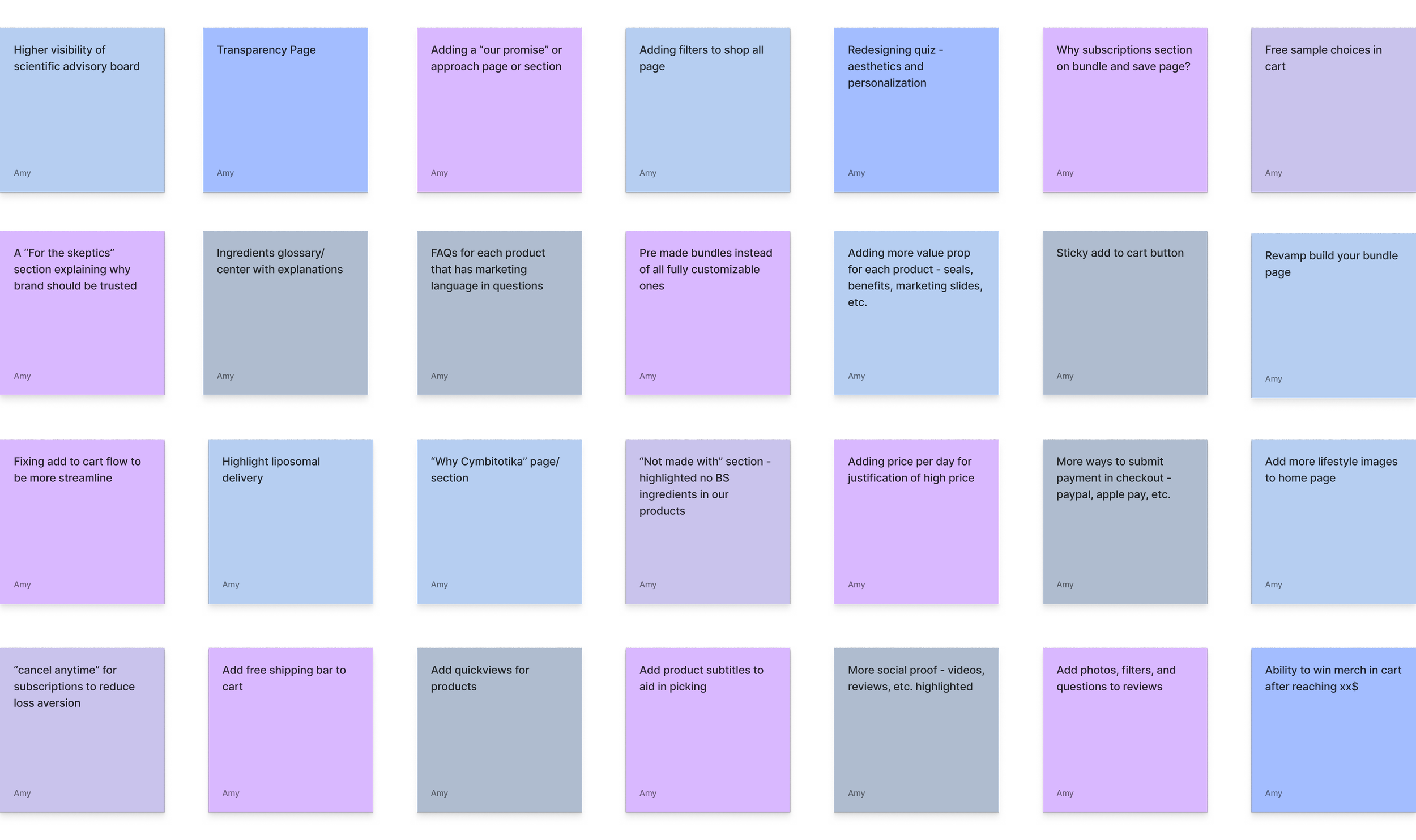
1. DECISION PARALYSIS
![User saying "This is tough . . . I don’t know what these [product names] mean, so I’m not sure what to choose.”](https://images.squarespace-cdn.com/content/v1/61eb2a5838f06f21431f7e0f/d75d076f-e4c9-407e-bb94-5b6da7a6dc64/Decision+paralysis.png)
Users struggle to choose supplements from our vast & unfamiliar product offerings.
• 4/5 testers mentioned the difficulty of choosing which products to pick
• Data analytics show that user drop off mid-funnel, after viewing multiple product detail pages
• CX gets a high volume of calls asking for help selecting products
• Survey results suggested that customers experienced decision fatigue and confusion when selecting products
2. CONFUSION

Current flows violates user expectations & causes friction while shopping.
• 5/5 testers mentioned confusion during the add to cart flow
• 3/5 testers said that the site didn’t feel trustworthy due to visual and flow issues
• CX receives calls and tickets about “bugs” that are often UX issues
• System Usability Scale question on the survey showed that the average user rated the website a 3/5 in ease of use.
3. TOO EXPENSIVE

Users are deterred by pricing due to lack of understanding of product value.
• 4/5 testers commented on the unusually high prices
• Our products cost 3-4x more than a typical drugstore supplements
• CX receives a fair volume of calls requesting discounts from customers
• Survey results showed that top reason for not purchasing an order was that it was "Too Expensive"
SETTING GOALS
How might we...
• Effectively communicate the value of our products to justify their higher price point?
• Build trust and confidence in our company and products?
• Streamline the shopping process to be easy and efficient?
• Aid customers in selecting the right products for them?
ideation
CRAZY 8S & WHITEBOARDING
Let’s brainstorm
Now it was time to explore solutions! Using personas, Crazy 8 exercises and cross-functional white boarding sessions, I came up with a wide range of ideas and also looked to e-commerce competitors for an analysis. This same process was repeated for each project that I led.
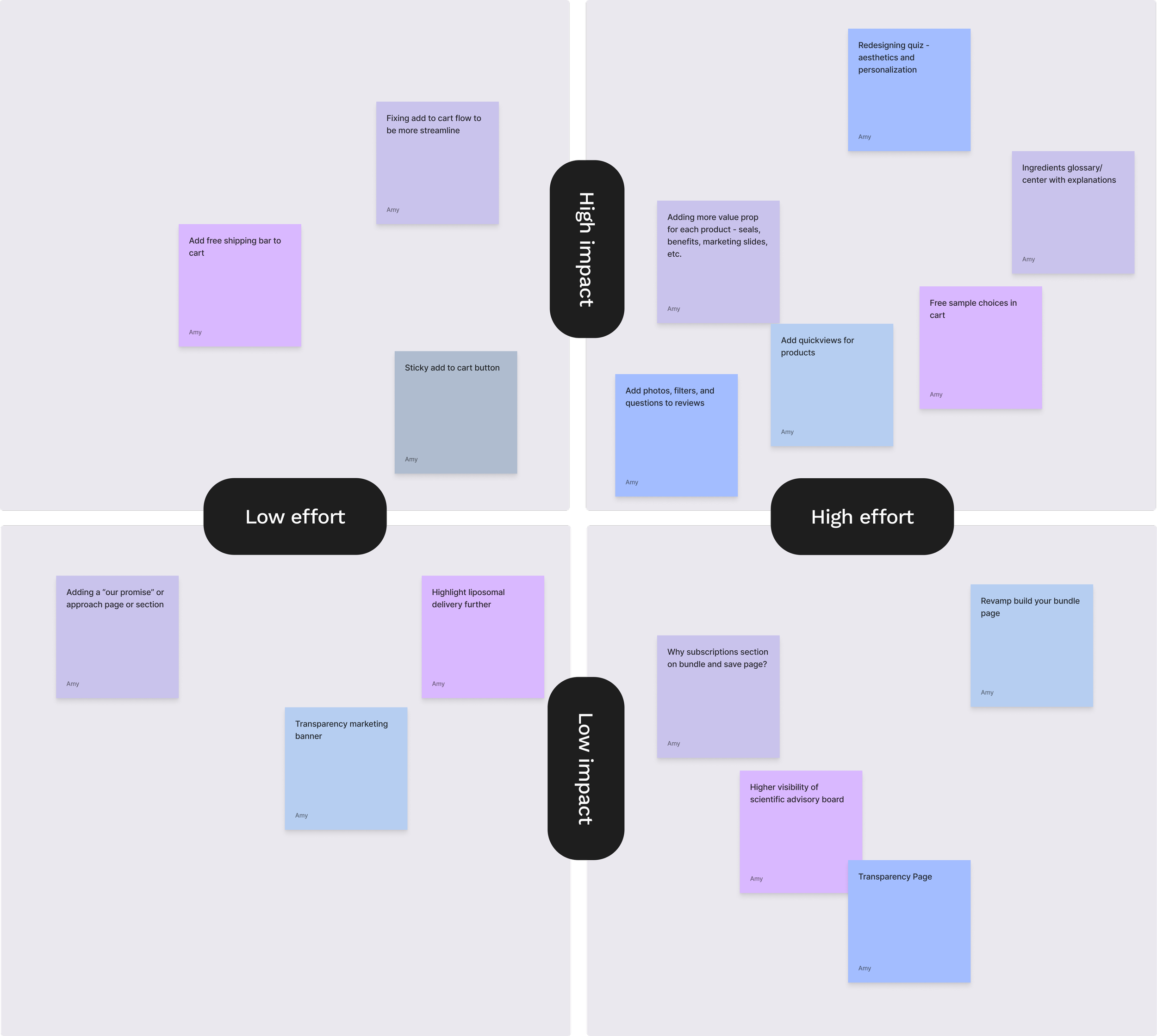
IMPACT VS. EFFORT MATRIX
Narrowing it down
Working closely with stakeholders and developers, I helped prioritize potential solutions to ensure we could make the biggest impact with the resources at hand. We used an impact vs. effort matrix to assess each idea's feasibility and identify the most promising ones to pursue and prioritize.
design
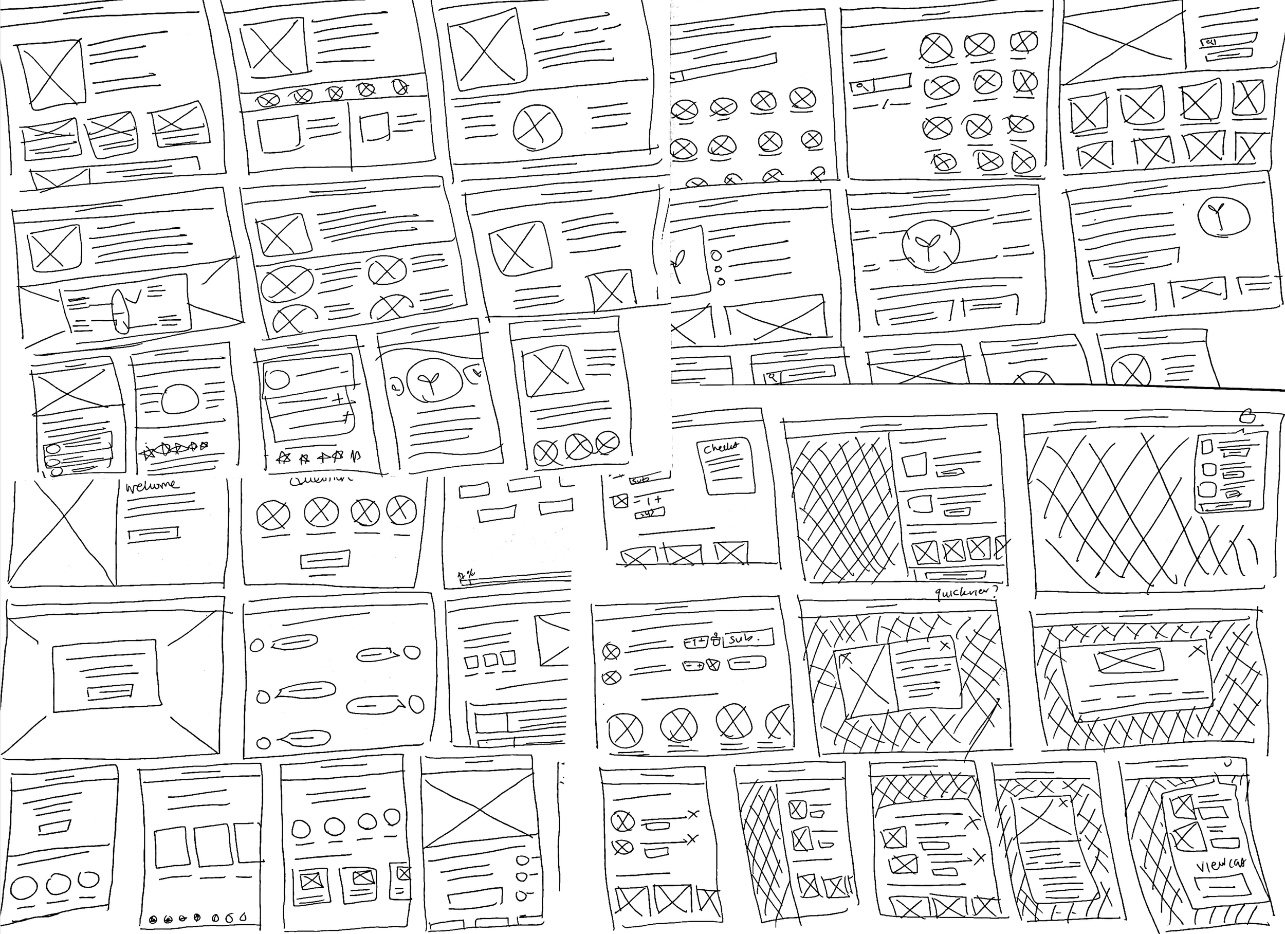
WIREFRAMING
Bringing the ideas to life
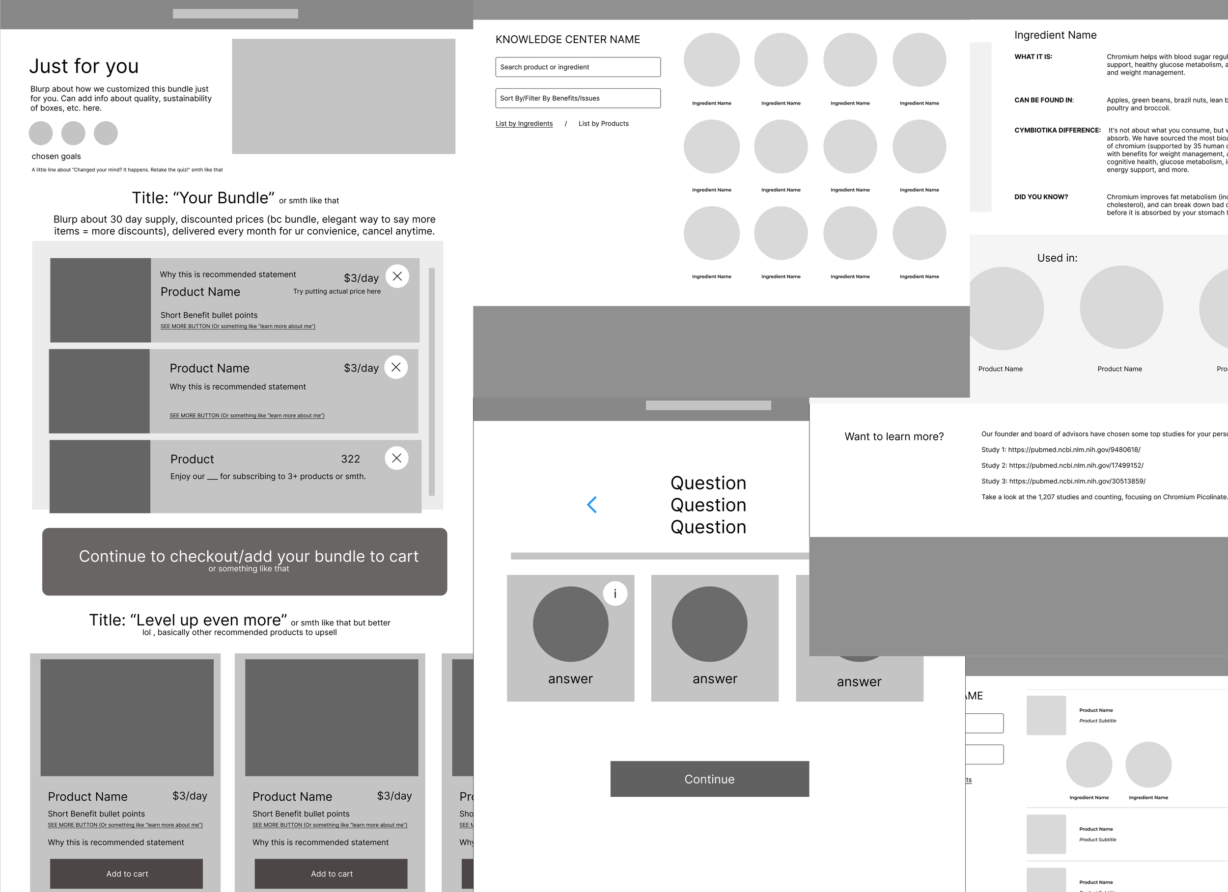
With a prioritized list of ideas in hand, I started wireframing each design on paper. Next, I brought the most viable concepts into Figma, where I developed low-fidelity wireframes to facilitate feedback from stakeholders and peers.
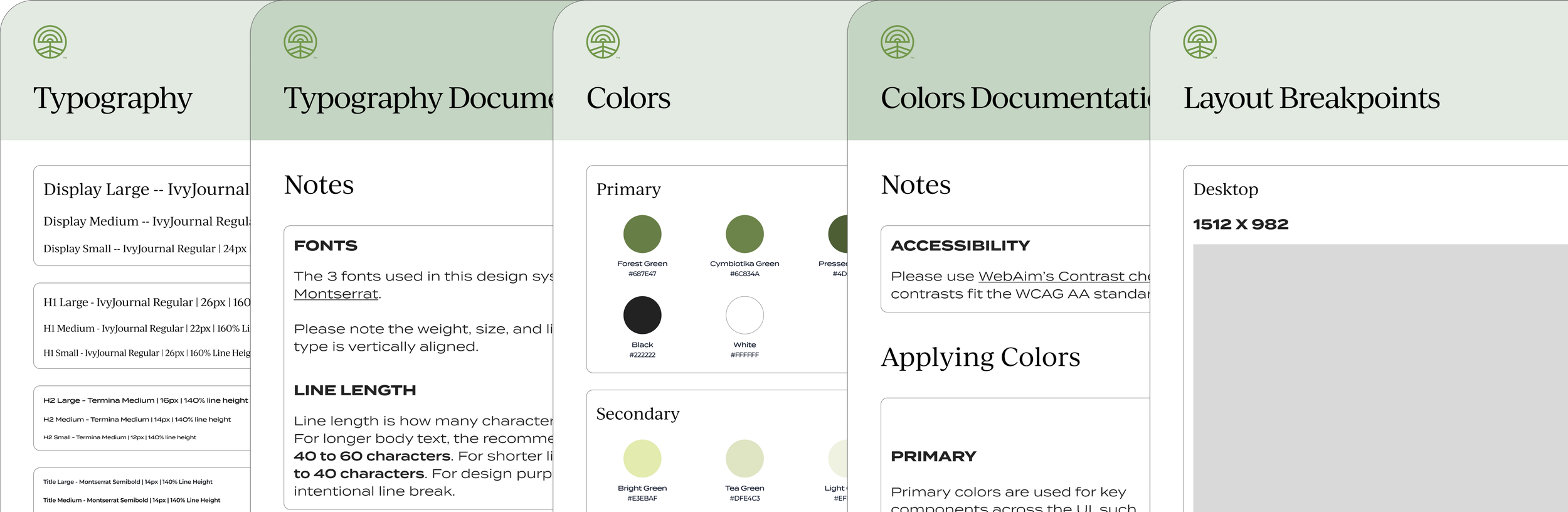
DESIGN SYSTEM
Ensuring consistency
To maintain design consistency, I also initiated the development of a UI Design System that aligned with the company's rebranding efforts.
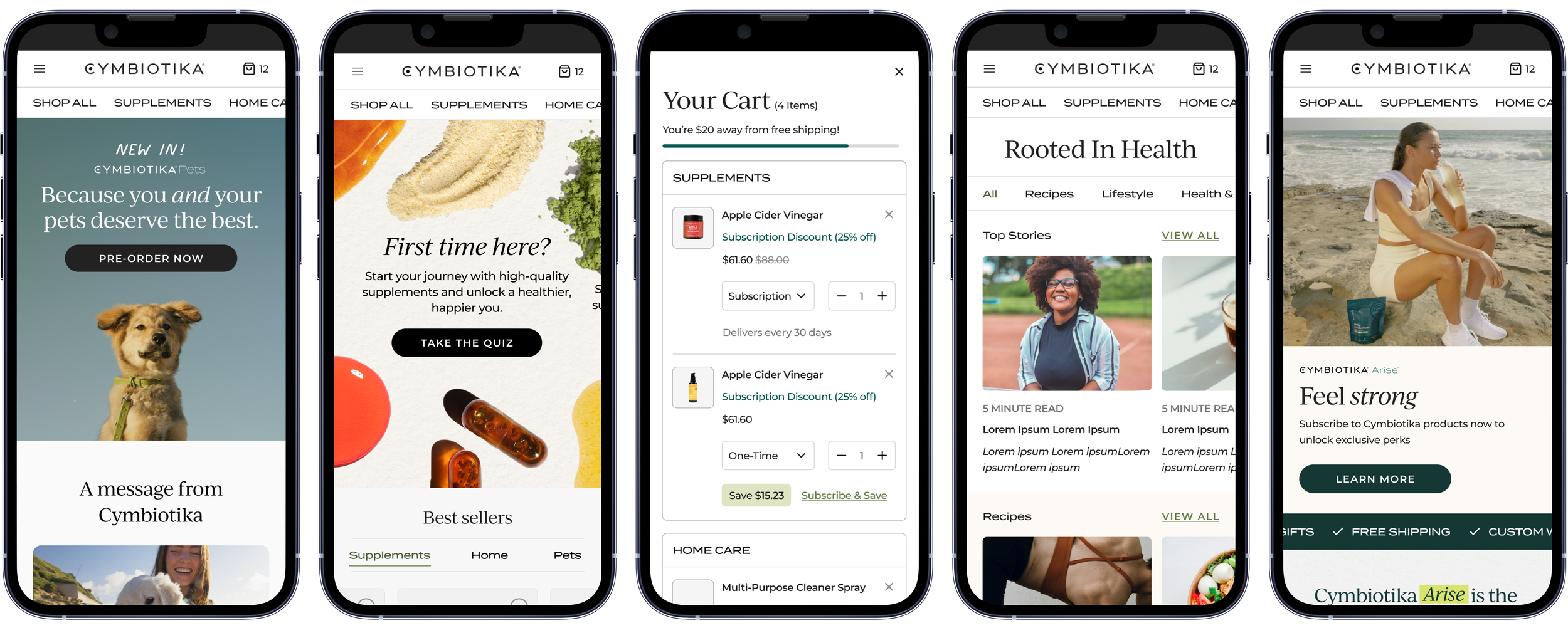
The Results
An easy and efficient shopping experience
BEFORE
Confusing shopping experience leading to an average SUS score of 3/5.
Outdated and inconsistent, lowering brand trust.
Friction in add to cart flow that violated user expectations.
AFTER
Improved average SUS score to 4.5/5 by streamlining shopping experience.
Updated and modern UI, increasing brand trust.
Reduced time and number of clicks to checkout
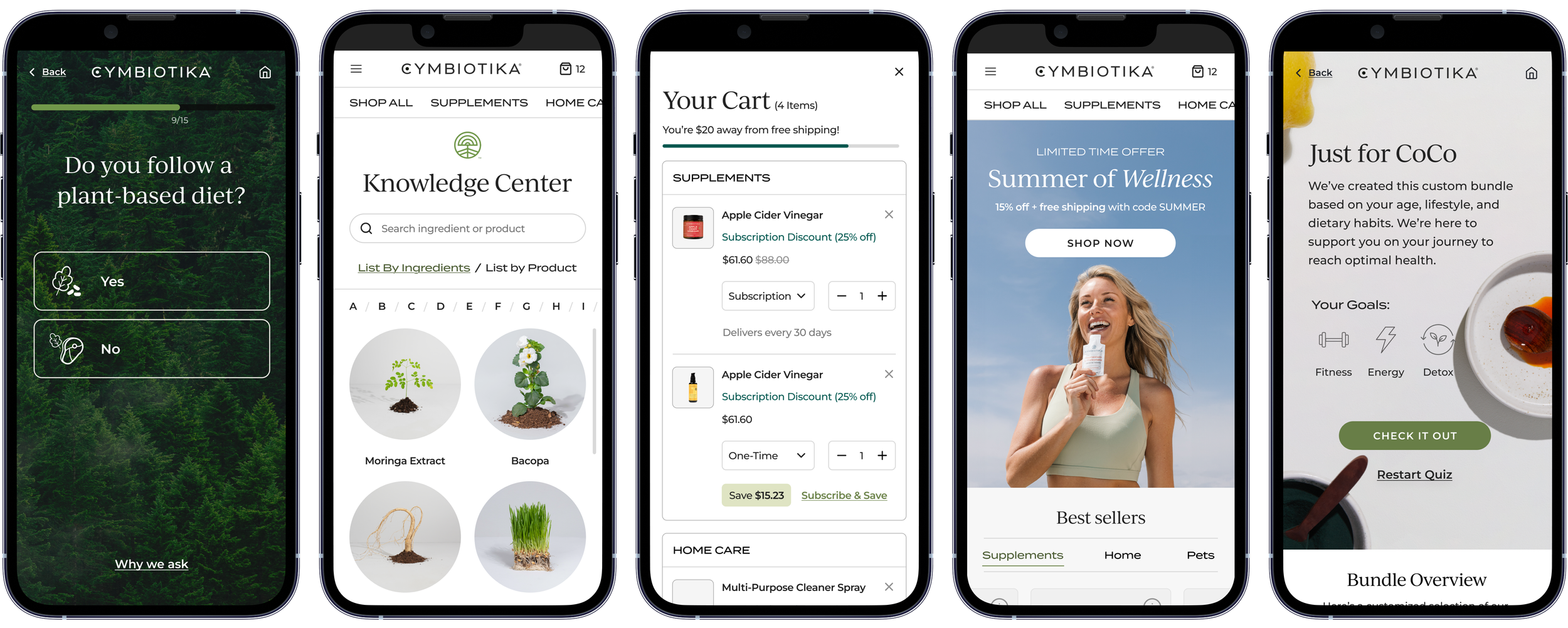
Helping people discover what’s right for them
BEFORE
Users experienced issues selecting what product was right for them, but the quiz questions lacked depth and personalization.
Quiz format was difficult to read and process.
Results were buggy and uninformative.
AFTER
Increased quiz conversion rate by ~25% through in-depth questions and personalized results.
Revamped layout and illustrated icons to aid visual processing.
Personalized recommendations with explanations.
Communicating value
BEFORE
Company and products lacked value proposition and high price justification.
Users wanted to learn more about the products - transparency was a core value but not practiced on website.
AFTER
Increased detailed information on value proposition by adding clear messaging and a Knowledge Center.
Received praise and satisfactory feedback about transparency and product education from customers.